 Các hàm xử lý chuỗi trong Javascript (cắt / tách / nối chuỗi ..)
  Chia lấy phần dư / chia lấy phần nguyên trong javascript
  Các cách khai báo biến trong Javascript
  Các sự kiện (Event) trong Javascript
 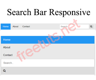 Hướng tạo thanh search bar bằng CSS
  Hàm array.slice() trong Javascript
  Tính tổng hai số bằng Javascript (cộng hai số)
  Cách khai báo biến trong PHP, các loại biến thường gặp
  Download và cài đặt Vertrigo Server
  Thẻ li trong HTML
  Thẻ article trong HTML5
  Cấu trúc HTML5: Cách tạo template HTML5 đầu tiên
  Cách dùng thẻ img trong HTML và các thuộc tính của img
  Thẻ a trong HTML và các thuộc tính của thẻ a thường dùng
 Bài 06: jQuery Mobile - Popup - Tooltip - Lightbox
Popup là một thành phần không thể thiếu trong các ứng dụng Mobile được, vì vậy jQuery Mobile cũng không quên xây dựng component này. Bạn có thể tạo nhiều loại Popup khác nhau như tooltip, image lightbox, ...

1. Tạo Popup
Để tạo một Popup thì bạn chỉ cần bổ sung một thuộc tính data-rel="popup" vào thẻ a của button, sau đó thuộc tính href trỏ đến ID của thẻ div chứa nội dung muốn show. Về phía thẻ div bạn phải khai báo thêm thuộc tính data-role="popup" để báo cho jQuery Mobile biết nó hiển thị ở dạng popup.
Ví dụ: XEM DEMO
<div data-role="page">
    <div role="main" class="ui-content">
        <a href="#login-form" data-rel="popup">LOGIN</a>
        <div data-role="popup" id="login-form" class="ui-content">
            <form>
                <table>
                    <tr>
                        <td>Username</td>
                        <td><input type="text" value=""/></td>
                    </tr>
                    <tr>
                        <td>Password</td>
                        <td><input type="password" value=""/></td>
                    </tr>
                    <tr>
                        <td></td>
                        <td><input type="button" value="Login"/></td>
                    </tr>
                </table>
            </form>
        </div>
    </div>
</div>
Khi bạn click vào thẻ a LOGIN thì sẽ hiển thị một popup LOGIN.
Bài viết này được đăng tại [free tuts .net]
2. Tạo Tooltip
Tooltip cũng là một dạng Popup và nó thường dùng trong hiệu ứng Hover đoạn text, nhưng chúng ta đang làm việc trên thiết bị di động nên không có hiệu ứng Hover mà sẽ có hiệu ứng Click.
Popup thường sẽ có một dấu nhọn trỏ đến nơi ta click và để làm điều này thì ta bổ sung thuộc tính data-arrow="true" vào thẻ div bao quanh popup.
Giá trị của thuộc tính data-arrow có thể là:
true: hiển thị dấu nhọn ở bất kì vị trí nào cho tương thích Responsive.false: không hiển thị dấu nhọnlohoặcthoặcrhoặcb: xác định hiển thịlefthoặctophoặcrighthoặcbottom.- "": khoảng trắng có tác dụng tương tự như
false.
Ví dụ: XEM DEMO
<div data-role="page">
    <div role="main" class="ui-content">
        <p>
            <a href="#popupInfo_true" data-rel="popup" data-transition="pop">TRUE</a> <br/>
            <a href="#popupInfo_false" data-rel="popup" data-transition="pop">FALSE</a> <br/>
            <a href="#popupInfo_l" data-rel="popup" data-transition="pop">L</a> <br/>
            <a href="#popupInfo_r" data-rel="popup" data-transition="pop">R</a> <br/>
            <a href="#popupInfo_b" data-rel="popup" data-transition="pop">B</a> <br/>
            <a href="#popupInfo_t" data-rel="popup" data-transition="pop">T</a>
        </p>
        <div data-role="popup" id="popupInfo_true" class="ui-content" data-arrow="true">
              <p>freetuts.net là một website học lập trình online miễn phí</p>
        </div>
        <div data-role="popup" id="popupInfo_false" class="ui-content" data-arrow="false">
              <p>freetuts.net là một website học lập trình online miễn phí</p>
        </div>
        <div data-role="popup" id="popupInfo_l" class="ui-content" data-arrow="l">
              <p>freetuts.net là một website học lập trình online miễn phí</p>
        </div>
        <div data-role="popup" id="popupInfo_r" class="ui-content" data-arrow="r">
              <p>freetuts.net là một website học lập trình online miễn phí</p>
        </div>
        <div data-role="popup" id="popupInfo_b" class="ui-content" data-arrow="b">
              <p>freetuts.net là một website học lập trình online miễn phí</p>
        </div>
        <div data-role="popup" id="popupInfo_t" class="ui-content" data-arrow="t">
              <p>freetuts.net là một website học lập trình online miễn phí</p>
        </div>
    </div>
</div>
3. Tắt Popup
Theo mặc định khi bạn click bên ngoài hoặc nhấn ESC thì Popup sẽ tắt. Nhưng đôi khi bạn muốn tạo một button để khi người dùng click để tắt Popup. Cũng có trường hợp bạn muốn click bên ngoài Popup thì nó sẽ không tắt, tức là bắt buộc muốn tắt thì thông qua một button nào đó bên trong Popup.
Để tạo một button Close Popup thì bạn phải đặt button đó nằm bên trong thẻ div cha và đồng thời bổ sung thuộc tính data-rel="back".
Để xóa bỏ chức năng click bên ngoài Popup và nhấn ESC thì ta thêm thuộc tính data-dismissible="false" vào thẻ div cha.
Ví dụ: XEM DEMO
<div data-role="page">
    <div role="main" class="ui-content">
        <a href="#leftButton" data-rel="popup" data-transition="fade">BUTTON NẰM BÊN TRÁI</a> <br/>
        <a href="#rightButton" data-rel="popup" data-transition="fade">BUTTON NẰM BÊN PHẢI</a> <br/>
        <a href="#dataDismissible" data-rel="popup" data-transition="fade">DATA DISMISSIBLE</a>
        <div data-role="popup" id="leftButton">
            <a href="#"  data-rel="back" class="ui-btn ui-corner-all ui-shadow ui-btn-a ui-icon-delete ui-btn-icon-notext ui-btn-left">Close</a>
            <p>Nhân ESC hoặc click button hoặc click bên ngoài sẽ tắt</p>
        </div>
        <div data-role="popup" id="rightButton">
            <a href="#"  data-rel="back" class="ui-btn ui-corner-all ui-shadow ui-btn-a ui-icon-delete ui-btn-icon-notext ui-btn-right">Close</a>
            <p>Nhân ESC hoặc click button hoặc click bên ngoài sẽ tắt</p>
        </div>
        <div data-role="popup" id="dataDismissible" data-dismissible="false">
            <a href="#"  data-rel="back" class="ui-btn ui-corner-all ui-shadow ui-btn-a ui-icon-delete ui-btn-icon-notext ui-btn-right">Close</a>
            <p>Bắt buộc click vào button mới tắt</p>
        </div>
    </div>
</div>
4. Tạo Photo lightbox
Photo lightbox là hiệu ứng khi click chuột vào hình ảnh nó sẽ hiển thị một Popup và phóng to hình ra.
Để tạo một Photo lightbox thì bạn chỉ cần xây dựng nội dung của Popup là một tấm hình.
Ví dụ: XEM DEMO
<div data-role="page">
    <div role="main" class="ui-content">
        <a href="#popupParis" data-rel="popup" data-transition="fade">
            <img src="https://freetuts.net/upload/tut_post/images/2015/10/30/494/paris.jpg" style="width:30%" />
        </a>
        <div data-role="popup" id="popupParis">
            <a href="#"  data-rel="back" class="ui-btn ui-corner-all ui-shadow ui-btn-a ui-icon-delete ui-btn-icon-notext ui-btn-right">Close</a>
            <img class="popphoto" src="https://freetuts.net/upload/tut_post/images/2015/10/30/494/paris.jpg" style="max-height:512px;">
        </div>
    </div>
</div>
5. Dialog
Mặc định Popup đã là một dạng dialog rồi nên ta chỉ cần bổ sung css cho giao diện, đồng thời thêm thuộc tính data-dismissible="false" cho thẻ div cha để đảm bảo người dùng luôn luôn click vào các button trong dialog.
Để Dialog luôn hiển thị giữa màn hình thì ta bổ sung thuộc tính data-position-to="window" cho button.
Để tạo hiệu ứng đẹp thì mình chọn data-transition="pop". Xem lại bài jQuery Mobile Transitions.
Ví dụ: XEM DEMO
<div data-role="page">
    <div role="main" class="ui-content">
        <a href="#popupDialog" data-rel="popup" data-position-to="window" data-transition="pop" class="ui-btn ui-corner-all ui-shadow ui-btn-inline ui-icon-delete ui-btn-icon-left ui-btn-b">Delete page...</a>

        <div data-role="popup" id="popupDialog" data-dismissible="false" style="max-width:400px;">
            <div data-role="header" data-theme="a"><h1>Delete Page?</h1></div>
            <div role="main" class="ui-content">
                <h3 class="ui-title">Are you sure you want to delete this page?</h3>
                <p>This action cannot be undone.</p>
                <a href="#" class="ui-btn ui-corner-all ui-shadow ui-btn-inline ui-btn-b" data-rel="back">Cancel</a>
                <a href="#" class="ui-btn ui-corner-all ui-shadow ui-btn-inline ui-btn-b" data-rel="back" data-transition="flow">Delete</a>
            </div>
        </div>
    </div>
</div>
6. Lời kết
Còn khá nhiều ví dụ về Popup trong jQuery Mobile nhưng chung quy lại là ý tưởng nội dung của Popup, vì vậy mình sẽ ngưng bài viết này tại đây.
Bài tiếp theo chúng ta sẽ tìm hiểu một các Position trong jQuery Mobile.

