 Các hàm xử lý chuỗi trong Javascript (cắt / tách / nối chuỗi ..)
  Chia lấy phần dư / chia lấy phần nguyên trong javascript
  Các cách khai báo biến trong Javascript
  Các sự kiện (Event) trong Javascript
  Hướng tạo thanh search bar bằng CSS
  Hàm array.slice() trong Javascript
  Tính tổng hai số bằng Javascript (cộng hai số)
  Cách khai báo biến trong PHP, các loại biến thường gặp
  Download và cài đặt Vertrigo Server
  Thẻ li trong HTML
  Thẻ article trong HTML5
  Cấu trúc HTML5: Cách tạo template HTML5 đầu tiên
  Cách dùng thẻ img trong HTML và các thuộc tính của img
  Thẻ a trong HTML và các thuộc tính của thẻ a thường dùng
 Bài 02: Sử dụng @Media CSS tạo Responsive cho Website
Trong bài này mình sẽ giới thiệu tới các bạn một thuộc tính trong CSS3 dùng để tạo responsive đó là thuộc tính @media.

1. @media CSS là gì?
@media CSS là một tính năng mới của CSS3, tính năng này cho phép ta tùy chỉnh CSS cho nhiều thiết bị khác nhau từ máy tính cho đến điện thoại smart phone và các thiết bị in ấn. Thuộc tính này có cú pháp như sau:
@media not|only mediatype and (media feature) {
    CSS-Code;
}
Bài viết này được đăng tại [free tuts .net]
Trong đó mediatype gồm các thuộc tính hay sử dụng sau:
- all: Dùng cho mọi thiết bị
- print: Dùng cho máy in
- screen: Dùng cho máy tính và các thiết bị smart phone
Thực tế vẫn còn nhiều nữa nhưng với lập trình web thì chúng ta thường sử dụng ba thuộc tính đó thôi. Và trước khi đi vào tìm hiểu các thuộc tính thì ban phải phân biệt hai khái niệm sau:
- Device: Là thiết bị sử dụng website như Laptop, Desktop, Iphone, ..
- Viewport: Là kích thước hiển thị của giao diện.
Và media featured thì gồm các thuộc tính sau:
- aspect-ratio: Tỉ lệ giữa chiều rộng và chiều cao của viewport
- min-aspect-ratio: Tỉ lệ tối thiểu giữa chiều rộng và chiều cao của viewport
- max-aspect-ratio: Tỉ lệ tôi đa giữa chiều rộng và chiều cao của viewport
- color: Số bits cho mỗi màu sắc của device
- color-index: Số lượng màu sắc mà device có thể hiển thị
- device-aspect-ratio: Tỉ lệ giữa chiều rộng và chiều cao của device
- max-device-aspect-ratio: Tỉ lệ tối đa giữa chiều rộng và chiều cao của device
- min-device-aspect-ratio: Tỉ lệ tối thiểu giữa chiều rộng và chiều cao của device
- device-height: Chiều cao của device
- device-width: Chiều rộng của device
- height: Chiều cao của viewport
- width: Chiều rộng của viewport
- max-width: Chiều rộng tối đa của viewport
- min-width: Chiều rộng tối thiểu của viewport
- max-height: Chiều cao tối đa của viewport
- min-height: Chiều cao tối thiểu của viewport
- min-device-width: Chiều rộng tối thiểu của device
- max-device-width: Chiều rộng tối đa của device
- min-device-height: Chiều cao tối thiểu của device
- max-device-height: Chiều cao tối đa của device
- orientation: Định hướng của khung nhìn (xoay hoặc không xoay thiết bị)
- resolution: Độ phân giải của thiết bị đầu ra (sử dụng dpi hoặc dpcm)
Ví dụ: Nếu chiều rộng của trình duyệt nhỏ hơn hoặc bằng 480px thì ẩn class .large.
@media only screen and (max-width: 480px){
  .large{
      display: none;
  }
}
Với đoạn code này thì khi bạn sử dụng điện thoại hoặc kéo nhỏ trình duyệt nhỏ hơn 480px thì đối tượng HTML đang sử dụng class .large sẽ bị ẩn. Nếu bạn thiết lập trong khoảng nào đó thì sử dụng thêm một điều kiện and nữa.
@media only screen and (max-width: 480px) and (min-width: 320px){
  .large{
      display: none;
  }
}
Với đoạn code này thì khi chiều rộng nằm trong khoảng 324px - 480px thì mới có tác dụng. Cò nếu ban muốn chỉ có tác dụng cho máy in thì làm như sau:
@media only print
  .large{
      display: none;
  }
}
Ngoài cách tạo trực tiếp trong CSS như vậy thì ban có thể tạo một file riêng và sử dụng thuộc tính media của thẻ link.
<link rel="stylesheet" media="mediatype and|not|only (media feature)" href="mystylesheet.css">
2. Sử dụng @media để tạo Responsive Website
Việc sử dụng media đòi hỏi bạn phải thành thạo CSS nói chung và am hiểu về độ phân giải các thiết bị nói riêng. Và sau đây mình sẽ làm một ví dụ nhỏ về cách tạo Responsive.
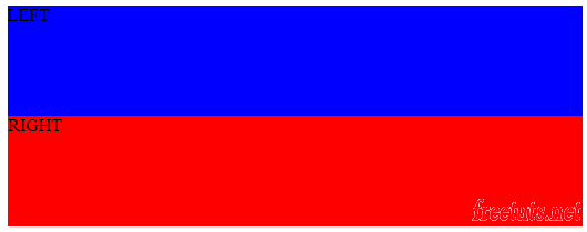
Cho đoạn mã HTML sau: XEM DEMO
<!DOCTYPE html>
<html>
    <head>
        <title>Tạo responsive</title>
        <meta charset="UTF-8">
        <meta name="viewport" content="width=device-width, initial-scale=1.0">
        <style>
            .left, .right{
                height: 400px;
            }
            .left{
                background: blue;
                float: left;
                width: 70%;
            }
            .right{
                background: red;
                float: right;
                width: 30%;
            }

        </style>
    </head>
    <body>
        <div class="container">
            <div class="left">
                LEFT
            </div>
            <div class="right">
                RIGHT
            </div>
        </div>
    </body>
</html>
Chạy giao diện này lên sẽ như sau:
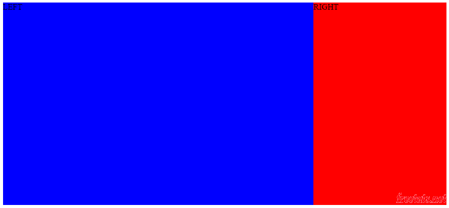
Đề bài yêu cầu hãy tạo responsive cho layout này theo đúng tiêu chuẩn sau:
- Nếu kích thước trình duyệt nhỏ hơn 769px thì hiển thị 1 hàng dọc
- Ngược lại thì hiển thị hai hàng dọc
Lúc này ta sẽ thiết lập CSS như sau:
@media only screen and (max-width: 768px){
    .left, .right{
        float: none;
        width: 100%;
    }
}
Chỉ cần thêm đoạn mã đó thôi là bài toán được giải quyết: XEM DEMO
Và đây là hình kết quả nếu bạn kéo nhỏ trình duyệt nhỏ hơn 789px.
3. Sử dụng @Media với các thiết bị di động và máy tính
Với danh sách các thuộc tính của @media thì ta dễ dàng phát hiện ra các thiết bị. Và sau đây là danh sách các câu query @media cho các thiết bị thông dụng.
Iphone:
/* ----------- iPhone 4 and 4S ----------- */

/* Portrait and Landscape */
@media only screen
  and (min-device-width: 320px)
  and (max-device-width: 480px)
  and (-webkit-min-device-pixel-ratio: 2) {

}

/* Portrait */
@media only screen
  and (min-device-width: 320px)
  and (max-device-width: 480px)
  and (-webkit-min-device-pixel-ratio: 2)
  and (orientation: portrait) {
}

/* Landscape */
@media only screen
  and (min-device-width: 320px)
  and (max-device-width: 480px)
  and (-webkit-min-device-pixel-ratio: 2)
  and (orientation: landscape) {

}

/* ----------- iPhone 5 and 5S ----------- */

/* Portrait and Landscape */
@media only screen
  and (min-device-width: 320px)
  and (max-device-width: 568px)
  and (-webkit-min-device-pixel-ratio: 2) {

}

/* Portrait */
@media only screen
  and (min-device-width: 320px)
  and (max-device-width: 568px)
  and (-webkit-min-device-pixel-ratio: 2)
  and (orientation: portrait) {
}

/* Landscape */
@media only screen
  and (min-device-width: 320px)
  and (max-device-width: 568px)
  and (-webkit-min-device-pixel-ratio: 2)
  and (orientation: landscape) {

}

/* ----------- iPhone 6 ----------- */

/* Portrait and Landscape */
@media only screen
  and (min-device-width: 375px)
  and (max-device-width: 667px)
  and (-webkit-min-device-pixel-ratio: 2) {

}

/* Portrait */
@media only screen
  and (min-device-width: 375px)
  and (max-device-width: 667px)
  and (-webkit-min-device-pixel-ratio: 2)
  and (orientation: portrait) {

}

/* Landscape */
@media only screen
  and (min-device-width: 375px)
  and (max-device-width: 667px)
  and (-webkit-min-device-pixel-ratio: 2)
  and (orientation: landscape) {

}

/* ----------- iPhone 6+ ----------- */

/* Portrait and Landscape */
@media only screen
  and (min-device-width: 414px)
  and (max-device-width: 736px)
  and (-webkit-min-device-pixel-ratio: 3) {

}

/* Portrait */
@media only screen
  and (min-device-width: 414px)
  and (max-device-width: 736px)
  and (-webkit-min-device-pixel-ratio: 3)
  and (orientation: portrait) {

}

/* Landscape */
@media only screen
  and (min-device-width: 414px)
  and (max-device-width: 736px)
  and (-webkit-min-device-pixel-ratio: 3)
  and (orientation: landscape) {

}
Galaxy phones:
/* ----------- Galaxy S3 ----------- */

/* Portrait and Landscape */
@media screen
  and (device-width: 320px)
  and (device-height: 640px)
  and (-webkit-device-pixel-ratio: 2) {

}

/* Portrait */
@media screen
  and (device-width: 320px)
  and (device-height: 640px)
  and (-webkit-device-pixel-ratio: 2)
  and (orientation: portrait) {

}

/* Landscape */
@media screen
  and (device-width: 320px)
  and (device-height: 640px)
  and (-webkit-device-pixel-ratio: 2)
  and (orientation: landscape) {

}

/* ----------- Galaxy S4 ----------- */

/* Portrait and Landscape */
@media screen
  and (device-width: 320px)
  and (device-height: 640px)
  and (-webkit-device-pixel-ratio: 3) {

}

/* Portrait */
@media screen
  and (device-width: 320px)
  and (device-height: 640px)
  and (-webkit-device-pixel-ratio: 3)
  and (orientation: portrait) {

}

/* Landscape */
@media screen
  and (device-width: 320px)
  and (device-height: 640px)
  and (-webkit-device-pixel-ratio: 3)
  and (orientation: landscape) {

}

/* ----------- Galaxy S5 ----------- */

/* Portrait and Landscape */
@media screen
  and (device-width: 360px)
  and (device-height: 640px)
  and (-webkit-device-pixel-ratio: 3) {

}

/* Portrait */
@media screen
  and (device-width: 360px)
  and (device-height: 640px)
  and (-webkit-device-pixel-ratio: 3)
  and (orientation: portrait) {

}

/* Landscape */
@media screen
  and (device-width: 360px)
  and (device-height: 640px)
  and (-webkit-device-pixel-ratio: 3)
  and (orientation: landscape) {

}
HTC:
/* ----------- HTC One ----------- */

/* Portrait and Landscape */
@media screen
  and (device-width: 360px)
  and (device-height: 640px)
  and (-webkit-device-pixel-ratio: 3) {

}

/* Portrait */
@media screen
  and (device-width: 360px)
  and (device-height: 640px)
  and (-webkit-device-pixel-ratio: 3)
  and (orientation: portrait) {

}

/* Landscape */
@media screen
  and (device-width: 360px)
  and (device-height: 640px)
  and (-webkit-device-pixel-ratio: 3)
  and (orientation: landscape) {

}
Ipad:
/* ----------- iPad mini ----------- */

/* Portrait and Landscape */
@media only screen
  and (min-device-width: 768px)
  and (max-device-width: 1024px)
  and (-webkit-min-device-pixel-ratio: 1) {

}

/* Portrait */
@media only screen
  and (min-device-width: 768px)
  and (max-device-width: 1024px)
  and (orientation: portrait)
  and (-webkit-min-device-pixel-ratio: 1) {

}

/* Landscape */
@media only screen
  and (min-device-width: 768px)
  and (max-device-width: 1024px)
  and (orientation: landscape)
  and (-webkit-min-device-pixel-ratio: 1) {

}

/* ----------- iPad 1 and 2 ----------- */
/* Portrait and Landscape */
@media only screen
  and (min-device-width: 768px)
  and (max-device-width: 1024px)
  and (-webkit-min-device-pixel-ratio: 1) {

}

/* Portrait */
@media only screen
  and (min-device-width: 768px)
  and (max-device-width: 1024px)
  and (orientation: portrait)
  and (-webkit-min-device-pixel-ratio: 1) {

}

/* Landscape */
@media only screen
  and (min-device-width: 768px)
  and (max-device-width: 1024px)
  and (orientation: landscape)
  and (-webkit-min-device-pixel-ratio: 1) {

}

/* ----------- iPad 3 and 4 ----------- */
/* Portrait and Landscape */
@media only screen
  and (min-device-width: 768px)
  and (max-device-width: 1024px)
  and (-webkit-min-device-pixel-ratio: 2) {

}

/* Portrait */
@media only screen
  and (min-device-width: 768px)
  and (max-device-width: 1024px)
  and (orientation: portrait)
  and (-webkit-min-device-pixel-ratio: 2) {

}

/* Landscape */
@media only screen
  and (min-device-width: 768px)
  and (max-device-width: 1024px)
  and (orientation: landscape)
  and (-webkit-min-device-pixel-ratio: 2) {

}
Galaxy tablets:
* ----------- Galaxy Tab 10.1 ----------- */

/* Portrait and Landscape */
@media
  (min-device-width: 800px)
  and (max-device-width: 1280px) {

}

/* Portrait */
@media
  (max-device-width: 800px)
  and (orientation: portrait) {

}

/* Landscape */
@media
  (max-device-width: 1280px)
  and (orientation: landscape) {

}
Nexus tablets:
/* ----------- Asus Nexus 7 ----------- */

/* Portrait and Landscape */
@media screen
  and (device-width: 601px)
  and (device-height: 906px)
  and (-webkit-min-device-pixel-ratio: 1.331)
  and (-webkit-max-device-pixel-ratio: 1.332) {

}

/* Portrait */
@media screen
  and (device-width: 601px)
  and (device-height: 906px)
  and (-webkit-min-device-pixel-ratio: 1.331)
  and (-webkit-max-device-pixel-ratio: 1.332)
  and (orientation: portrait) {

}

/* Landscape */
@media screen
  and (device-width: 601px)
  and (device-height: 906px)
  and (-webkit-min-device-pixel-ratio: 1.331)
  and (-webkit-max-device-pixel-ratio: 1.332)
  and (orientation: landscape) {

}
Kindle Fire:
/* ----------- Kindle Fire HD 7" ----------- */

/* Portrait and Landscape */
@media only screen
  and (min-device-width: 800px)
  and (max-device-width: 1280px)
  and (-webkit-min-device-pixel-ratio: 1.5) {

}

/* Portrait */
@media only screen
  and (min-device-width: 800px)
  and (max-device-width: 1280px)
  and (-webkit-min-device-pixel-ratio: 1.5)
  and (orientation: portrait) {
}

/* Landscape */
@media only screen
  and (min-device-width: 800px)
  and (max-device-width: 1280px)
  and (-webkit-min-device-pixel-ratio: 1.5)
  and (orientation: landscape) {

}

/* ----------- Kindle Fire HD 8.9" ----------- */

/* Portrait and Landscape */
@media only screen
  and (min-device-width: 1200px)
  and (max-device-width: 1600px)
  and (-webkit-min-device-pixel-ratio: 1.5) {

}

/* Portrait */
@media only screen
  and (min-device-width: 1200px)
  and (max-device-width: 1600px)
  and (-webkit-min-device-pixel-ratio: 1.5)
  and (orientation: portrait) {
}

/* Landscape */
@media only screen
  and (min-device-width: 1200px)
  and (max-device-width: 1600px)
  and (-webkit-min-device-pixel-ratio: 1.5)
  and (orientation: landscape) {

}
Laptop:
/* ----------- Non-Retina Screens ----------- */
@media screen
  and (min-device-width: 1200px)
  and (max-device-width: 1600px)
  and (-webkit-min-device-pixel-ratio: 1) {
}

/* ----------- Retina Screens ----------- */
@media screen
  and (min-device-width: 1200px)
  and (max-device-width: 1600px)
  and (-webkit-min-device-pixel-ratio: 2)
  and (min-resolution: 192dpi) {
}
Apple Watch:
/* ----------- Apple Watch ----------- */
@media
  (max-device-width: 42mm)
  and (min-device-width: 38mm) {

}
Môt 360 Watch:
/* ----------- Moto 360 Watch ----------- */
@media
  (max-device-width: 218px)
  and (max-device-height: 281px) {

}
Trên là những thiết bị thông dụng. Tuy nhiên nếu bạn muốn biết chính xác hơn nữa thì hãy vào trang mydivice.io để xem nhé.
4. Lời kết
Như vậy mình đã giới thiệu xong chức năng và nhiệm vụ của query @media, hy vọng qua bài này bạn sẽ có cái nhìn tổng quát về cách sử dụng @media trong CSS để tạo ra website responsive. Bài này mình xin dừng tại đây, bài tiếp theo mình sẽ hướng dẫn cách sử dụng jQuery để tạo Responsive.