 Các hàm xử lý chuỗi trong Javascript (cắt / tách / nối chuỗi ..)
  Chia lấy phần dư / chia lấy phần nguyên trong javascript
  Các cách khai báo biến trong Javascript
  Các sự kiện (Event) trong Javascript
 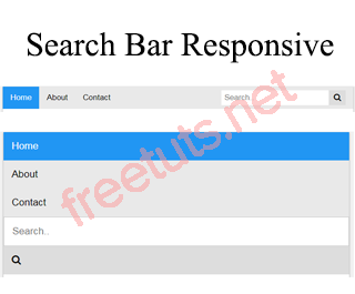 Hướng tạo thanh search bar bằng CSS
  Hàm array.slice() trong Javascript
  Tính tổng hai số bằng Javascript (cộng hai số)
  Cách khai báo biến trong PHP, các loại biến thường gặp
  Download và cài đặt Vertrigo Server
  Thẻ li trong HTML
  Thẻ article trong HTML5
  Cấu trúc HTML5: Cách tạo template HTML5 đầu tiên
  Cách dùng thẻ img trong HTML và các thuộc tính của img
  Thẻ a trong HTML và các thuộc tính của thẻ a thường dùng
 Tạo hiệu ứng mưa với HTML và CSS
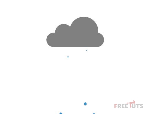
Một trang web nếu hiển thị được các hiệu ứng thời tiết nắng, mưa, gió thì sẽ rất sinh động. Hôm nay, freetuts sẽ hướng các bạn tạo hiệu ứng mưa như hình

1. Phần HTML
Phần bố cục chia làm 2 mảng chính: đám mây và giọt mưa.
<!DOCTYPE html>
<html>
<head>
  <meta charset="utf-8">
  <meta http-equiv="X-UA-Compatible" content="IE=edge">
  <title>Rain</title>
  <meta name="viewport" content="width=device-width, initial-scale=1">
  <link rel="stylesheet" type="text/css" media="screen" href="rain.css">
  <script src="main.js"></script>
</head>
<body>
  <div class="cloud">
    <div class="c1"></div>
    <div class="c2"></div>
    <div class="c3"></div>
  </div>
  <div class="drop d1"></div>
  <div class="drop d2"></div>
  <div class="drop d3"></div>
  <div class="drop d4"></div>
  <div class="drop d5"></div>
  <div class="drop2 d1"></div>
  <div class="drop2 d2"></div>
  <div class="drop2 d3"></div>
  <div class="drop2 d4"></div>
  <div class="drop2 d5"></div>
</body>
</html>
Trong giọt mưa, freetuts chia thành hai nhóm nhỏ nhằm tạo hiệu ứng mưa to.
Các bạn có thể tạo nhiều nhóm hơn để mưa to hơn nữa.
Bài viết này được đăng tại [free tuts .net]
2. Phần CSS
Trước hết hãy lướt qua phần mã nguồn
body {
  display: flex;
  justify-content: center;
  align-items: center;
  min-height: 500px;
  position: relative;
}

.cloud {
  position: relative;
  height: 100px;
  width: 200px;
}

.cloud > div {
  border: 2px solid black;
  border: none;
  background-color: grey;
  animation: lightning linear 2s infinite;
}

@keyframes lightning {
  0% {
    background-color: #ffffb3
  }
  5% {
    background-color: grey;
  }
  8% {
    background-color: #ffffb3
  }
  10% {
    background-color: grey;
  }
  100% {
    background-color: grey;
  }
}

.c1 {
  position: absolute;
  width: 60px;
  height: 60px;
  border-radius: 30px;
  bottom: 20px;
  left: 30px;
  z-index: 1;
}

.c2 {
  position: absolute;
  width: 100px;
  height: 100px;
  border-radius: 50px;
  right: 20px;
  bottom: 5px;
  z-index: 1;
}

.c3 {
  position: absolute;
  width: 200px;
  height: 50px;
  border-radius: 25px;
  bottom: 0;
  z-index: 2;
}

.drop {
  position: relative;
}

.drop:after {
  display: block;
  content: "";
  background: #2e8ece;
  width: 20px;
  height: 20px;
  position: absolute;
  left: 315px;
  animation: drop 1s ease infinite;
  border-radius: 50%;
  transform: scale(0.7,1) rotate(45deg);
  box-shadow: 1px 1px 7px #1a1a1a;
}

.drop2 {
  position: relative;
}

.drop2::after {
  display: block;
  content: "";
  background: #2e8ece;
  width: 20px;
  height: 20px;
  position: absolute;
  left: 315px;
  animation: drop 1.5s 0.03s ease infinite;
  border-radius: 50%;
  transform: scale(0.7,1) rotate(45deg);
  box-shadow: 1px 1px 7px #1a1a1a;
}


.drop.d1::after {
  left: -40px;
  animation-delay: -0.2s;
}

.drop.d2::after {
  left: -70px;
  animation-delay: -0.35s;
}

.drop.d3::after {
  left: -100px;
  animation-delay: -0.3s;
}

.drop.d4::after {
  left: -130px;
  animation-delay: 0;
}

.drop.d5::after {
  left: -160px;
  animation-delay: 0.13s;
}

.drop2.d1::after {
  left: -45px;
  animation-delay: -0.7s;
}

.drop2.d2::after {
  left: -75px;
  animation-delay: -0.45s;
}

.drop2.d3::after {
  left: -105px;
  animation-delay: -0.93s;
}

.drop2.d4::after {
  left: -135px;
  animation-delay: 0.2;
}

.drop2.d5::after {
  left: -165px;
  animation-delay: 0.613s;
}

@keyframes drop {
  0%{
    transform: scale(0.1,0.1) rotate(45deg);
    top: 25px;
    border-top-left-radius: 50%;
  }
  95%{
    border-top-left-radius: 0;
    transform: scale(0.5,0.5) rotate(45deg);
  }
  100%{
    top: 300px;
    border-top-left-radius: 50%;
    transform: scale(0.5,0.1) rotate(45deg);
  }
}
Bước 1: tạo định dạng cho thẻ body
body {
  display: flex;
  justify-content: center;
  align-items: center;
  min-height: 500px;
  position: relative;
}
Bước 2: tạo định dạng cho lớp cloud
.cloud {
  position: relative;
  height: 100px;
  width: 200px;
}
Bước 3: tạo định dạng chung cho từng nhóm mây con
.cloud > div {
  border: 2px solid black;
  border: none;
  background-color: grey;
  animation: lightning linear 2s infinite;
}
Bước 4: tạo hiệu ứng sấm chớp
@keyframes lightning {
  0% {
    background-color: #ffffb3
  }
  5% {
    background-color: grey;
  }
  8% {
    background-color: #ffffb3
  }
  10% {
    background-color: grey;
  }
  100% {
    background-color: grey;
  }
}
Lưu ý sự thay đổi màu nền cần nhanh, nên độ lệch giữa các khoảng phần trăm phải thấp.
Bước 5: tạo định dạng các đám mây con
.c1 {
  position: absolute;
  width: 60px;
  height: 60px;
  border-radius: 30px;
  bottom: 20px;
  left: 30px;
  z-index: 3;
}

.c2 {
  position: absolute;
  width: 100px;
  height: 100px;
  border-radius: 50px;
  right: 20px;
  bottom: 5px;
  z-index: 3;
}

.c3 {
  position: absolute;
  width: 200px;
  height: 50px;
  border-radius: 25px;
  bottom: 0;
  z-index: 3;
}
Bước 6: tạo định dạng nhóm giọt mưa 1
.drop {
  position: relative;
}

.drop:after {
  display: block;
  content: "";
  background: #2e8ece;
  width: 20px;
  height: 20px;
  position: absolute;
  left: 315px;
  animation: drop 1s ease infinite;
  border-radius: 50%;
  transform: scale(0.7,1) rotate(45deg);
  box-shadow: 1px 1px 7px #1a1a1a;
}
Bước 7: tạo định dạng nhóm giọt mưa 2
.drop2 {
  position: relative;
}

.drop2::after {
  display: block;
  content: "";
  background: #2e8ece;
  width: 20px;
  height: 20px;
  position: absolute;
  left: 315px;
  animation: drop 1.5s 0.03s ease infinite;
  border-radius: 50%;
  transform: scale(0.7,1) rotate(45deg);
  box-shadow: 1px 1px 7px #1a1a1a;
}
Bước 8: tạo độ trễ và vị trí cho các giọt mưa nhóm 1
.drop.d1::after {
  left: -40px;
  animation-delay: -0.2s;
}

.drop.d2::after {
  left: -70px;
  animation-delay: -0.35s;
}

.drop.d3::after {
  left: -100px;
  animation-delay: -0.3s;
}

.drop.d4::after {
  left: -130px;
  animation-delay: 0;
}

.drop.d5::after {
  left: -160px;
  animation-delay: 0.13s;
}
Bước 9: tạo độ trễ và vị trí cho các giọt mưa nhóm 2
.drop2.d1::after {
  left: -45px;
  animation-delay: -0.7s;
}

.drop2.d2::after {
  left: -75px;
  animation-delay: -0.45s;
}

.drop2.d3::after {
  left: -105px;
  animation-delay: -0.93s;
}

.drop2.d4::after {
  left: -135px;
  animation-delay: 0.2;
}

.drop2.d5::after {
  left: -165px;
  animation-delay: 0.613s;
}
Bước 10: tạo hiệu ứng giọt mưa rơi
@keyframes drop {
  0%{
    transform: scale(0.1,0.1) rotate(45deg);
    top: 25px;
    border-top-left-radius: 50%;
  }
  95%{
    border-top-left-radius: 0;
    transform: scale(0.5,0.5) rotate(45deg);
  }
  100%{
    top: 300px;
    border-top-left-radius: 50%;
    transform: scale(0.5,0.1) rotate(45deg);
  }
}
3. Lời Kết
Qua bài viết này, các bạn đã học được cách tạo hiệu ứng mưa rơi kèm sấm chớp. Ở bài tiếp theo, freetuts sẽ hướng dẫn các bạn hiệu ứng thời tiết nắng đẹp.
Cảm ơn các bạn, hẹn gặp lại trong bài viết tiếp theo.
Danh sách file tải về
| Tên file tải về | Pass giải nén |
|---|---|
| Tải mã nguồn bài viết | freetuts.net hoặc gameportable.net |